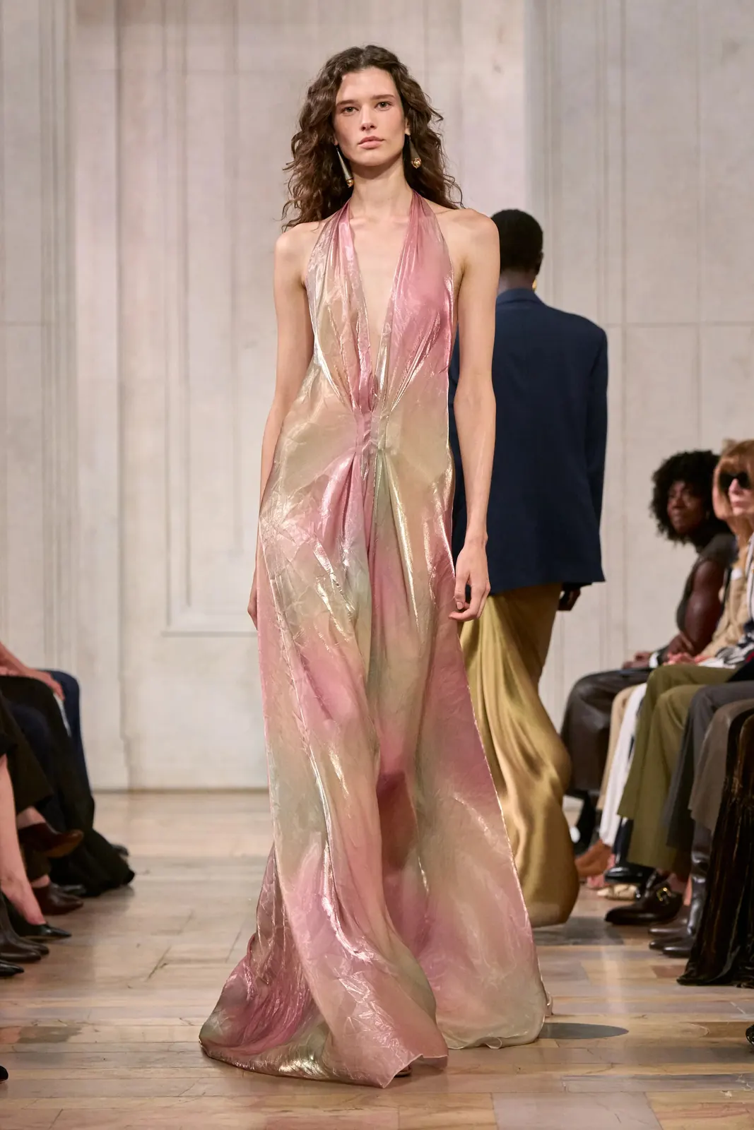
Fifteen color stories for Spring Summer 2027, each matched to a Pantone TCX reference from the runway. Scarlet, candy pink and violet against turquoise, mint and acid lime, anchored by chocolate and sand.
Chapter V of VFifteen color storiesReleases 17 November 2026
Color Stories·S/S 27·Scarlet·Coral·Candy Pink·Violet·Turquoise·Mint·Acid Lime·Sunshine·Cobalt·Chocolate·Sand·Mila Prints Design·Color Stories·S/S 27·Scarlet·Coral·Candy Pink·Violet·Turquoise·Mint·Acid Lime·Sunshine·Cobalt·Chocolate·Sand·Mila Prints Design·
The season, in color.
Fifteen color stories. Nine pairings.
The S/S 27 palette runs warm to cool and back again. Scarlet, orange and coral open it; candy pink, powder pink, violet and lavender carry it into romance; turquoise, mint, green and acid lime cool it; sunshine yellow and cobalt sharpen it. Chocolate and sand anchor everything, with black and ivory always present. Each color here is matched to its closest Pantone TCX reference from the 1,186 runway looks, and named with the houses that wear it. The nine pairings that close the chapter show how the season combines them, which is where a color story becomes collection architecture.
Fifteen color stories for S/S 27
Each color is shown with an approximate on-screen chip and its Pantone TCX reference, the houses that wear it, and how it reads in print.
Lanvin · Paris
IRed
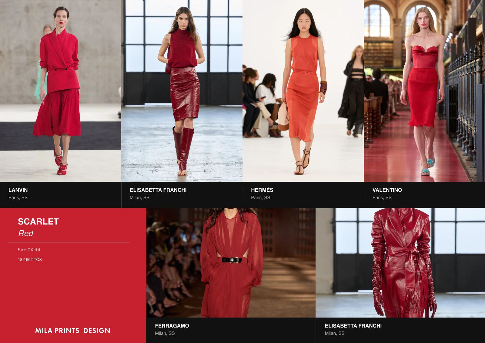
Scarlet
Pantone 18-1662 TCX
The season's red is a true scarlet, worn with authority. Lanvin cuts it into tailoring, Elisabetta Franchi and Ferragamo into evening, and Hermès and Valentino give it full looks. Scarlet holds its own as a solid, which is exactly why it works as a print ground: a scarlet field with a single tonal motif, or a fine black line drawing, keeps the intensity of the color while giving it a narrative. In S/S 27 it is often worn head to toe.
Hermès · Paris
IITangerine
Orange
Pantone 16-1462 TCX
A ripe tangerine, warm rather than acid. Hermès makes it a signature, from shirt dresses to leather, with Loewe, Miu Miu and Stella McCartney following. Orange reads young on its own and sophisticated next to brown, which is how the yellow pairings at the end of this chapter use it. In print, tangerine works as the accent that lifts a neutral ground: one orange line in a foulard, or the heart of a painted bloom.
Stella McCartney · Paris
IIICoral pink
Coral
Pantone 16-1546 TCX
Coral sits between orange and pink and softens both. Stella McCartney cuts a coral trench dress, Etro and Elie Saab bring it into fluid evening, and Ralph Lauren and Loewe follow. It is the most flattering warm of the palette, and the one that travels most naturally across a collection, from solid tailoring to a printed silk. Coral pairs with sand and cream, and it gives a 70s paisley or a painted floral a warmer, sunlit cast.
Chanel · Paris
IVPink
Candy Pink
Pantone 15-2216 TCX
A clear, sweet pink, worn without irony. Chanel makes it a tweed suit, Blumarine and Elie Saab make it romantic, and Miu Miu and Prada make it sharp. Candy pink carries the season's romance, and its pairings show its range: with cream it softens, with black it turns graphic, with aqua it turns playful. For print, candy pink is a strong ground for small-scale motifs, and the color that turns a gingham or a candy stripe into a summer story.
Christian Dior · Paris
VBlush
Powder Pink
Pantone 14-1907 TCX
The quietest pink of the season, close to skin. Christian Dior pleats it in chiffon, Stella McCartney and Erdem soften tailoring and lace with it, and Isabel Marant washes it into the boho story. Powder pink is a ground more than a statement. It flatters sheers, holds embroidery beautifully, and gives a painterly blur or a faded paisley the vintage cast the season is asking for.
Monse · New York
VITrue purple
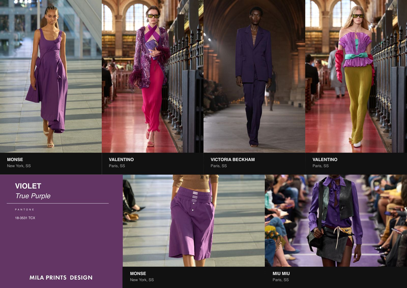
Violet
Pantone 18-3531 TCX
A saturated, true purple. Monse sculpts it in cotton, Valentino carries it from column skirts to full evening, and Victoria Beckham and Miu Miu follow. Violet is the season's most assertive cool, and Valentino's pairings prove it: violet with fuchsia, violet with brown, violet with lime. For print, violet works as a deep ground for luminous motifs, and as the shadow color inside an iridescent blur.
Blumarine · Milan
VIILilac & periwinkle
Lavender
Pantone 15-3817 TCX
Violet's softer register, between lilac and periwinkle. Blumarine edges it in ruffled chiffon, Louis Vuitton, Valentino and Monse bring it into day, and Givenchy and Victoria Beckham keep it precise. Lavender is the color of the faded boho story, the one Isabel Marant paints into paisley in Chapter I. In print, it is a gentle ground for florals and watercolor effects, and a cool counterpoint to coral and sand.
Valentino · Paris
VIIIAquamarine
Turquoise
Pantone 14-4816 TCX
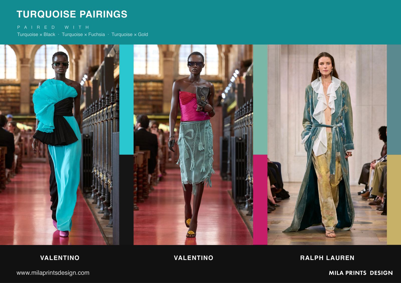
A bright aquamarine that brings water into the palette. Valentino builds whole looks around it, Ralph Lauren and Lanvin cut it clean, and Blumarine and Alberta Ferretti make it fluid. Its pairings are the most daring of the chapter: turquoise with black, with fuchsia, with gold. Turquoise is a natural print color for summer, at its strongest when it meets a warm counterpart rather than another cool.
Isabel Marant · Paris
IXSage & mint
Mint
Pantone 13-0117 TCX
A pale green that moves between mint and sage. Stella McCartney and Isabel Marant use it on utility pieces, Erdem on satin and lace, and Valentino and Loewe follow. Mint is the season's freshest neutral: soft enough to wear head to toe, cool enough to calm a warm palette. In print it works as a ground for botanical and photographic motifs, and as the green inside a painted bloom.
Givenchy · Paris
XLeaf & bottle
Green
Pantone 17-0145 TCX
A full, grassy green, from leaf to bottle. Givenchy cuts it in leather, Valentino and Miu Miu carry it into ginghams and evening, and Loewe, Agua Bendita and Monse follow. Green pairs with fuchsia, with yellow and with white this season, each pairing a different story. For a house with green in its collection DNA, this is the season to deepen it, in a check, a foulard or a leaf drawn at full scale.
Sergio Hudson · New York
XIElectric yellow-green
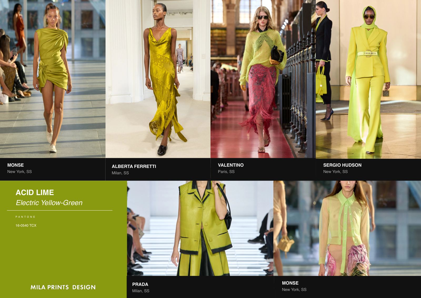
Acid Lime
Pantone 16-0540 TCX
The season's sharpest color: an electric yellow-green. Sergio Hudson cuts it into a full suit, Monse and Valentino use it as a jolt of energy, and Alberta Ferretti and Prada follow. Acid lime is rarely quiet, which makes it most effective in small doses within a print: the line in a micro-geometric, the edge of a blur. Worn against violet or brown, as the pairings show, it turns from loud to considered.
Loewe · Paris
XIIYellow
Sunshine
Pantone 14-0848 TCX
A warm, buttery yellow, more sunlight than lemon. Loewe prints it into florals, Hermès and Lanvin wear it as a solid, and Miu Miu and Etro follow. Sunshine yellow pairs with orange, brown and black, and with each it changes temperature. As a print ground it is generous and summery; as an accent it brings light into a chocolate or navy palette.
Ralph Lauren · New York
XIIIElectric blue
Cobalt
Pantone 19-3952 TCX
A deep, electric blue. Ralph Lauren sweeps it into a silk shirt gown, Givenchy cuts it sharp, and Gabriela Hearst and Valentino follow. Cobalt is the season's anchor among the brights: strong enough to stand alone, steady enough to hold the palette together. Its pairings are classic and modern at once: blue with white, with chocolate, with denim. In print, cobalt gives a foulard or a stripe its authority.
Ferragamo · Milan
XIVBrown & cognac
Chocolate
Pantone 19-1218 TCX
The season's deepest neutral, from chocolate to cognac. Hermès and Ferragamo work it in leather, Khaite in quiet tailoring, and Elie Saab and Monse in evening. Chocolate replaces black in many of the season's strongest looks, and it pairs with black, pink and lime. For print it is a rich ground: tonal leopard, 70s paisley and painted florals all read warmer and more considered on brown than on black.
Elisabetta Franchi · Milan
XVCamel
Sand
Pantone 14-1118 TCX
A warm camel, the color of the season's tailoring. Elisabetta Franchi, Hermès and Ferragamo cut it into trench coats and wide trousers, Loewe and Monse into soft daywear, and Etro into its boho story. Sand anchors the palette with chocolate and black. It is the natural ground for the season's tonal prints: the leopard that almost disappears, the faded paisley, the micro-geometric that reads as texture.
Nine color pairings
Black & Ivory
Black with ivory, ivory with black, black with cream: the season's constant. At Louis Vuitton, Gabriela Hearst and Christian Dior.
Red
Red with black, red with pink, red with cobalt. At Prada, Elisabetta Franchi and Givenchy.
Pink
Pink with cream, pink with black, fuchsia with aqua. At Elie Saab, Prada and Blumarine.
Violet
Violet with fuchsia, violet with brown, violet with lime. At Valentino and Monse.
Turquoise
Turquoise with black, turquoise with fuchsia, turquoise with gold. At Valentino and Ralph Lauren.
Green
Green with fuchsia, green with yellow, green with white. At Valentino, Givenchy and Monse.
Yellow
Yellow with orange, yellow with brown, yellow with black. At Miu Miu, Hermès and Prada.
Blue
Blue with white, blue with chocolate, blue with denim. At Givenchy and Monse.
Brown
Brown with black, brown with pink, brown with lime. At Hermès, Monse and Loewe.
Pages from the report
Access the report
Chapter V in full.
Tell us where to send it. The Color Stories chapter opens on the next screen, and a copy arrives in your inbox.
Fifteen Pantone-matched color stories read from the S/S 27 runways.
Nine color pairings, each with the houses that wear them.
The same authorial eye behind every MPD commission.
The studio reviews every reader personally. Your details stay with us and are never circulated.
Offered by the studio.
Chapter V releases Tuesday 17 November.
The chapter PDF opens here on release day. All fifteen color stories and nine pairings are already on this page.
17 November 2026
Questions on S/S 27 color
What are the key colors for Spring Summer 2027?
Fifteen color stories define S/S 27: scarlet, orange, coral, candy pink, powder pink, violet, lavender, turquoise, mint, green, acid lime, sunshine yellow, cobalt, chocolate and sand. The palette runs from warm reds and pinks to cool turquoise and acid lime, anchored by chocolate, sand and black.
What are the Pantone colors for S/S 27?
The closest Pantone TCX references read from the S/S 27 runways include Scarlet 18-1662, Coral 16-1546, Candy Pink 15-2216, Violet 18-3531, Turquoise 14-4816, Acid Lime 16-0540, Cobalt 19-3952, Chocolate 19-1218 and Sand 14-1118. Each color story on this page carries its own code.
Is acid lime a trend for 2027?
Yes. Acid lime, an electric yellow-green close to Pantone 16-0540 TCX, is the sharpest color of S/S 27. Sergio Hudson cuts it into a full suit, and Monse, Valentino, Alberta Ferretti and Prada use it as an accent. It reads most considered next to violet or brown.
Which color pairings define S/S 27?
Nine pairings recur: black and ivory, red with black or cobalt, pink with cream or aqua, violet with fuchsia or lime, turquoise with black or gold, green with fuchsia or yellow, yellow with orange or brown, blue with white or chocolate, and brown with black or pink.
The palette is read.
Its architecture is a strategic decision.